Billboard analysis 2

billboard vougue

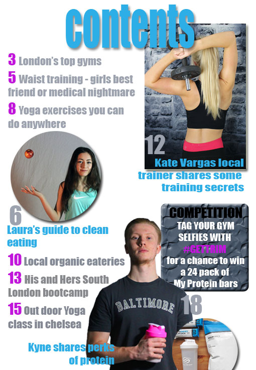
This billboard advert is for VOGUE fashion magazine. Although this is not the same genre as my own magazine billboard advert it still utilises general conventions and audience pleasures.

This advert uses an image of the front cover of the issue they are promoting, this is common to ensure to consumer recognises the issue in the shops and also catches their attention with an insight to its content from its cover lines, main image etc. They have also used a celebrity Cindy Crawford to create synergy between the brand and the celebrities fashion or style. This also will draw fans attention as their would be enticed to by the magazine purely for its content on her. The have also promoted their website to promote other forms of consumption. The image on the front cover of Cindy Crawford is of her looking very glamorous and she is posing with a direct gaze and a smouldering look. This adds sex appeal to the magazine making her more of a sexy fashion “icon” appealing to females wanting to be more like her and also drawing the attention of males to the billboard and she is somewhat being presented through a male gaze.

Double page spread drafts

dbl draft

I like this photo of my models as they are both holding a direct gaze with the reader drawing them into the article.I like the background being dark as is blends in with the rest of the page. However the lighting is a bit too strong which makes my models look a bit washed out. The header colour clashes with the image and the font is a bit too basic for a magazine.dbl pho

I like the image cropped into  circle as it leave plenty of space for text to surround it. The title works well in the right hand corner and I like the way it overlaps the image, the boxing off of the tag line also makes it stand out whilst not pulling away from the brand name “Mr & Mrs”. however the image slightly blurred as I resized it making it look less professional and I had to smudge out creases in the sheet used for the background. The lighting is okay but you lose some of my male models face into the shadow.georgia dbl

I like this layout as I have adapted the circle from the last draft using a higher quality image that did not blur when I resized it. I have also boxed off the tagline again and it gives the same effect. I prefer this design as the image allows me to pull the colour into the rest of the article and the background is solid. The lighting for this image is slightly darker but this avoids the washed outlook bright lighting can have on models. I may chose to create two double page spread with either of my image used in my second and third mock up to get some audience feedback and a better idea of what works best.

Contents Drafts

contents aaa

Once i had my images in place i played around with different fonts and colours to see what worked best. I liked the font i used for the majority of this contents page but the colours clashed far too much with each other and the pictures. The Header font was too different from my house style across the rest of the page but i like the shadow effect i put on it and its placing partially over my images.

contents ya

I then played around with the fonts and colour to come up with a design to continue with. i  preferred the colour scheme used here as it was more muted but still acted to make certain elements stand out. I changed the font of header and will add the effect from the first image to give the front cover depth. The font i used is also very similar to the one i used on my front cover carrying the theme through to tie the contents and front cover together.

Ancillary 2 – Radio ad research

American Cycle and Fitness is an american sports shop. I have chosen to analyse one of their radio adverts as they aim to target Americans so have a somewhat localised target audience and they also are aiming to appeal to a fitness crown much like my own advert will.

The advert begins by listing off various American historical events, building a relationship between the brand and the country and creating a patriotic attitude towards the brand, this could be used in my advert to promote the London area as it has a great sense of significance to a British audience and particularly those living in London. By listing off major events and then the founding of American Cycle and Fitness it attempts to put itself up with the same achievement as these events promoting itself as important and something to be celebrated. The narrator has a very strong American accent which adds some comedic value to it and would also make it stand out amongst other radio adverts s it makes the advert more fun feeling and quirky. Then when the adverts goes on to explain the American Cycle and Fitness brand the voice changes to a more natural tone and the music is upbeat and fluent fitting with the narration. The advert also promotes its brand equity as it has been established for a long time “since 1928 that’s over 80 years” this is quite  a common route of promotion and could be used when promoting my magazine perhaps as an anniversary issue also common in billboard promotion. The advert then finishes by promoting its “best brands” and “great deals” common in any advertising, using buzzwords to make their product seem superior to another. They also promote their website page to encourage more forms of consumption and ultimately purchase of their product, this is something I may include in my radio advert and it seems to be a common convention and effective. One fault of the advert however is that is seems to drag on a bit at the end throwing in as much as they can which makes it feel a bit rushed. I will avoid doing this in my radio advert.


Front Cover Drafts

front cover draft 1 - not useable

I liked the image used in the draft above, however when i tried to insert my title “TRIM” the text wasn’t recognisable from behind the model and therefore made the picture unsuitable. I will most likely use this image in my contents page or double page spread as I like the quality of the image and the lighting.

front cover draft 2 - useable title stage

I then tested out another photo placing the font either side of the model and i really liked the appearance. Most of the page was filled by the model but there was still plenty of room for cover lines. Once i had decided this was a suitable image I could then start to add  more features to it to make develop it into a professional looking magazine.

front cover draft 2 CHANGES

I began by changing the font of the title to make it stand out more and changed the colour, i played around with various different colours and fonts before choosing an impact style font and white text to stand out but fit with the image. I have began developing a three colour scheme across the magazine as this is typical for a magazine front cover. I Also chose to use a bright pink colour swatched to match the pink colour on my models tights, this helps tie the image into the cover lines and stops the cover looking fragmented. I also added a barcode to start making my magazine look like an actual front cover. I will continue to edit my front cover and add more cover lines and conventions to get it as close to a professional level as possible.