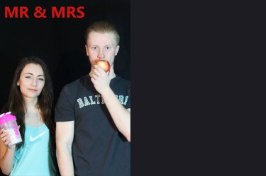
I like this photo of my models as they are both holding a direct gaze with the reader drawing them into the article.I like the background being dark as is blends in with the rest of the page. However the lighting is a bit too strong which makes my models look a bit washed out. The header colour clashes with the image and the font is a bit too basic for a magazine.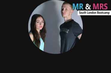
I like the image cropped into circle as it leave plenty of space for text to surround it. The title works well in the right hand corner and I like the way it overlaps the image, the boxing off of the tag line also makes it stand out whilst not pulling away from the brand name “Mr & Mrs”. however the image slightly blurred as I resized it making it look less professional and I had to smudge out creases in the sheet used for the background. The lighting is okay but you lose some of my male models face into the shadow.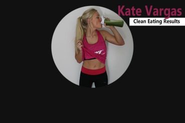
I like this layout as I have adapted the circle from the last draft using a higher quality image that did not blur when I resized it. I have also boxed off the tagline again and it gives the same effect. I prefer this design as the image allows me to pull the colour into the rest of the article and the background is solid. The lighting for this image is slightly darker but this avoids the washed outlook bright lighting can have on models. I may chose to create two double page spread with either of my image used in my second and third mock up to get some audience feedback and a better idea of what works best.
